Comp-Fu Answers Part 2
Once again I’ve pulled out keywords from my piwik reports!
graphics to rec709 lut
— anonymous
“Graphics” can mean a dozen things. If you have designed some stuff in Photoshop or taken screenshots, for example, they are probably in sRGB. To convert it in Nuke for a rec709 project, just select sRGB in the read node. This will linearize it and if you put on the rec709 LUT you’ll see that it appears a bit darker than in Photoshop. In Fusion, you can convert the image using the Gamut tool (input sRGB, output ITU-B-R.709, both gamma checkboxes enabled).
in fusion for which reason there is no gamma slider??
— anonymous
That made me laugh. All I could think of is this meme 🙂
I guess you mean the nifty viewer controls that Nuke has? You need to add a viewer LUT for this manually. There’s the GainGamma Fuse that ships with Fusion or my gpu accelerated sRGB/rec709 LUTs.
nuke ramp tutorials
— anonymous
Oh come on. What’s next? A tutorial on how to prepare a peanut butter sandwich?!
how many lens flares in total recall
— anonymous
Well, I didn’t count them when I talked about the movie on my blog. But here’s somebody who did!
Comp-Fu Answers Part 1
Welcome to my new show where I answer questions that are based on google searches that brought users to my website. (disclaimer: I’m using piwik for web site statistics and search keywords are transmitted by the user’s browser. It’s anonymous though, so relax.)
what is color space and color temperature
— anonymous
Thanks for your question, Mr Anonymous. Color Space and Color Temperature can be looked up on Wikipedia. In VFX specifically, the term color space usually means the way that a color is being split into separate channels for digital processing. RGB by default (red, green and blue channels). It can be converted back and forth to spaces like HLS, Lab, YUV and so on where you still have red, green and blue channels but now each channel contains a different color attribute. In HLS, the red channel contains a color’s hue, for example.

Color temperature is a measure for how cool or warm an image appears (top row of the image). It has a well-defined physical background but basically it’s your white balance setting. It can be adjusted in most RAW converters and although it’s not a color space you can adjust it using the TMI system which includes a magenta-green-value in addition to the orange-blue color temperature axis. It’s available in Shake and Nuke and I’ve made a macro that brings it to Fusion.
color temperature in Nuke
— anonymous
I think there’s no color temperature node in Nuke, but I adjust the temperature of an image using a Gain adjustment:
Open the gain color wheel and enable the TMI sliders if they’re not yet visible. Then, adjust the T slider to your liking. The image might appear brighter or darker now so as a second step, I use the V slider of the HSV group and bring it back to 1.0. This makes sure that the image stays as bright as before (that’s not totally true, but it’s a good rule of thumb. Of course you can tweak every slider to your liking).
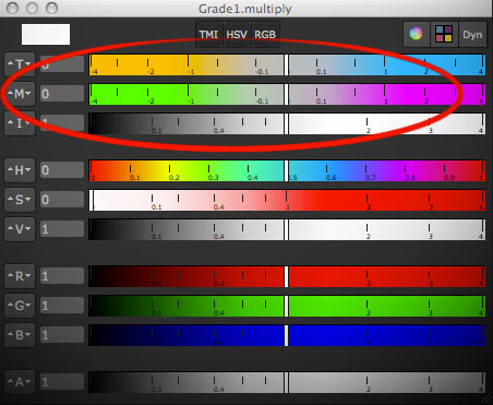
I choose the ColorCorrector instead of Grade or Multiply because it has a saturation slider that is applied before the gain and can be used to make the warm or cold tint of an image stronger (if you desaturate the image completely before tinting you’re doing what Photoshop’s Hue/Saturation adjustment calls colorizing the image).
game of thrones color grading
— anonymous
That’s funny. I’m no authority but a while ago I made a blog post on that topic. And coincidentally it involves color temperature 🙂
Hansel & Gretel: Wife Beaters
The-Editing-Room.com has a humorous script of Hansel & Gretel which I watched recently as well. After being slightly enthusiastic about the trailer’s vfx and steam punk-y flair I gotta say that Hansel & Gretel is an even bigger piece of crap than I had feared.
I can recommend it for people who enjoy watching women being hit into the guts and faces with blunt objects.
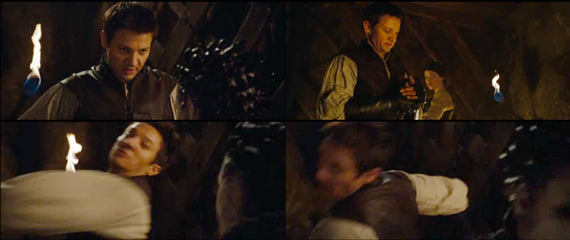
“Believe me, honey, this hurts me more than it hurts you.”

“Hello, I’d like to apply for the position of screenwriter. I have recently divorced my wife and am willing to weave my sick revenge fantasies into the plot…”
I applaud the movie for using make-up effects for witches and trolls, some aerial shots looked like well-done miniatures and a lot of splatter stuff felt like practical SFX as well. I don’t need this to be VFX all the time. Had they been consistent with it, the movie might have been a little gem in an era of CGI.
But towards the end – or rather mere seconds before the credits start rolling – we are treated with some top-notch bullet-time Krakatoa particles full-CG expensive eyecandy which feels awkwardly out of place. After all, the first 99% of the movie’s effects were not much better than what TV shows like Buffy or Grimm are doing. For example, not a single witch-flying-away-on-broom effect looked good.
I don’t really accuse it of weirdly budgeted effects or even plot inconsistencies. Come on, it’s a popcorn fantasy movie. I accuse it of being boring boring boring. That feeling creeps in after just a couple of minutes of watching dialog scenes that consist mostly of awkward silence. It’s like the actors are thinking “I’ve delivered my line, why doesn’t anybody yell “CUT” already?!” and it shows on their faces.
That, and the misogyny.

rating: 3/10 (the “way below expectations” level where it’s in the company of Uwe Boll productions like “BloodRayne” or “Alone in the Dark”)
Trailer Shot
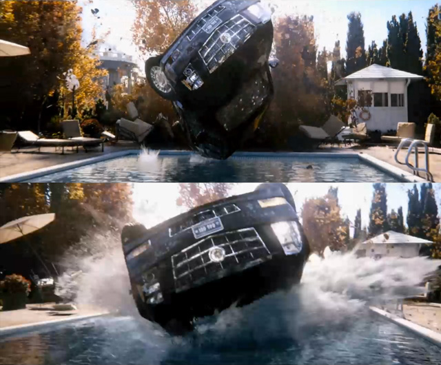
The fruits of my labor (and Jan’s plus of a bunch of other hard-working colleagues in lighting, animation and fx simulation of course).
Light Swoosh
Here’s a quick test for a particle effect done in Fusion.
Music: “Dance of the Gypsy” by Jeris (feat. A.M. mews by MommaLuv SKyTower)
licensed under a Creative Commons license: creativecommons.org/licenses/by/2.5/
You can download the comp here. It demonstrates a few other things like linear gamma, lens flares and glows. You need the Time3D fuse from vfxpedia and the Krokodove plugins.
Lesser-Known Fusion Features
Made another video tutorial:
This one is a quick tour of a couple of lesser-known features in eyeon Fusion: changing the frame step size, proxy footage for loaders, hotkeys for roto, view and subview settings, local render queue, hardware status.
You might already know some of those “secrets”, but they pop up every now and then on forums so I thought I’d collect them into a small video.
Specular Highlights Compositing Reference
Welcome to the first installation of a series where I tell you how to improve your CGI/compositing by looking at frickin mother nature for reference.
Often CGI lacks that last bit of realism. In the case of outdoor surfaces it can be due to the lack of proper specular highlights. They require high sampling rates, they tend to flicker, but it pays off to spend some compositing effort on then – even if you ultimately paint and reproject them manually.
The key to realistic atmospheric effects are proper reference photos. Here’s a photo of one of Chicago’s commuter trains glistening in the morning sun:
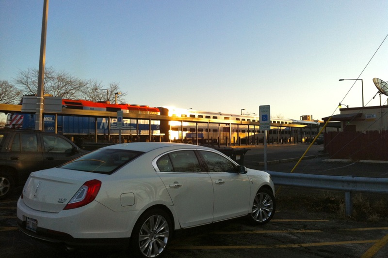
The glow that seems to eat away from the steel roof looks like that because it comes from a reflection that’s magnitudes brighter than the rest of the image. To recreate this in comp you need to work in linear color space with values way above 1.0 and a sharp, super-bright yellowish reflection of the sun. Don’t be afraid to go up to 20 or even higher.
Now add a tiny blur to the image (the natural scattering of the air and the lens) so you hardly notice it on most of the image. The bright spot, however, will grow into a large glow not unlike one in the photo (then fine-tune your comp with different blur radii at different strengths or add a blurred luma key of the highlights once more).
Look at the car now. It’s parked in the shadows yet it doesn’t look murky or dark at all. It’s lit solely by the sky’s ambient light which is still bright enough to cause a lot of specular highlights. In reality – and from the point of view of an unbiased renderer like Arnold for example – there is no “specular pass” anyways. It’s all just tiny glossy reflections of a bright light source. And the sky is more than enough. I can’t tell you how to render rims like these but as a compositor you should be prepared to fake some highlights using a normal pass for example if the 3D lacks those details.
Some more thoughts about why the car in this picture looks so well-integrated (yeah, it’s real):
- The color of the highlights matches the sky. Especially the area around the front bumper turns into a mirror-like surface due to the Fresnel properties of the car paint. It matches the sky in color and brightness.
- The sun’s reflection on the train is so bright that it reflects once more in the car’s rooftop. Your raytracer would need to calculate at least two bounces!
- The wheels are black and you can hardly distinguish them from the car’s underside. Yes, clients would tell you they want to see the rubber if this were CGI. But try to balance it. Too much detail in the shadows would make this image look like one of those fake HDR images.